‘COLOR PALETTES’ WITH KATE HOLT
| Happy Firday Guys….I’m so excited to have Kate Holt of Flower Wild join us today. Kate’s floral designs are simply STUNNING…I adore her and I love it when she stops by to share her love and passion for beautiful flowers with us….today Kate shares her passion for ‘color’ with us….let’s check out all the beauty from Kate…..Enjoy!!!
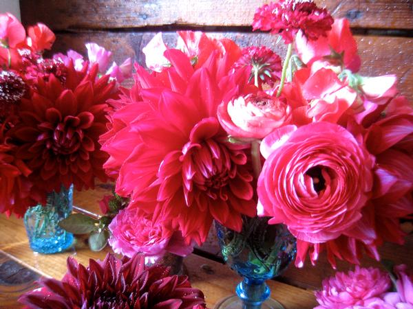
‘Color…..It is a quizzical thing don’t you think? And we all seem to have our favorites from a very young age. Mine has always been a deep raspberry red. But colors are nothing by themselves are they? They need each other. Complementary colors, opposite colors etc. And in the case of wedding flowers, we see a lot of pink and white. This season Yellow is a very contagious color. Happy and pure as it is! |
![]()
 |
![]()
 |
![]()
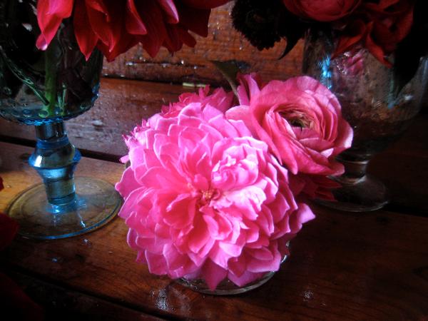
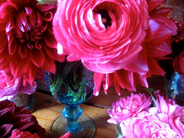
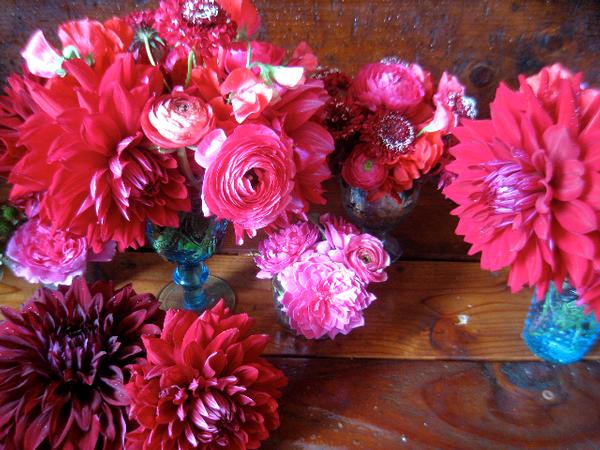
| So I always like to play with colors that brides are often afraid to choose for themselves. Red is usually used in such a tacky or overdone way that you can’t see the true beauty of it’s bold look. Ideally I would love to showcase these red beauties on a turquoise and white patterned runner to offset the flowers.
This would be a unique approach to a seaside wedding that plays on the coral/red tones of the reef rather than the muted blues and pinks of the shore. Or these could run the length of a raw wood picnic table with a southwestern theme. Dried pepper garland intermingled, corn husk wrapped favors. Turquoise napkin rings. But you see, the red works better with the blue. And both are unexpected colors for a wedding table. Red might not be for everyone….but it makes you think about how to use your favorite color and get a unique and pretty looking table out of it! |
![]()
 |
![]()
 |
![]()
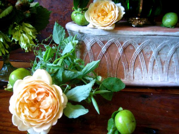
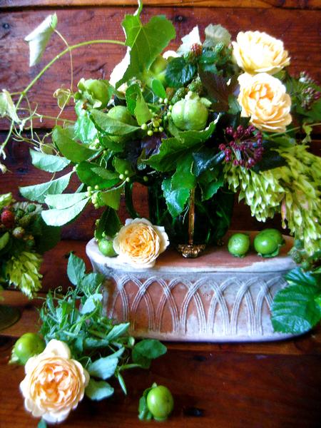
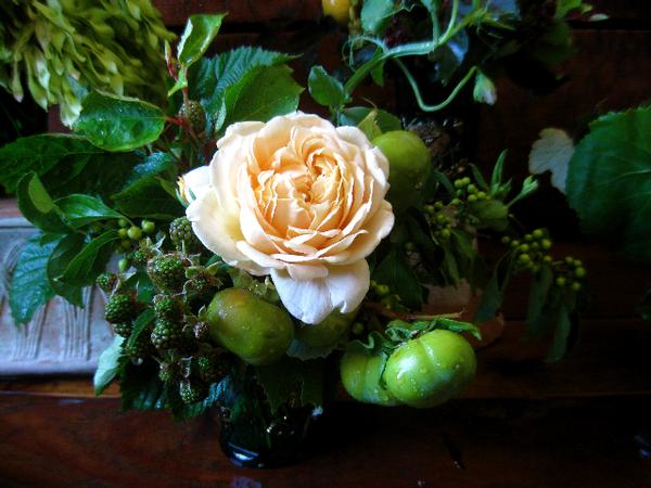
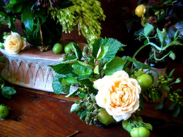
| Next, I began with the idea of creating a solely green tablescape. Essentially leaving flowers out of the mix. But in the end, these were calling out to me for just a small sprinkling of some ridiculously gorgeous garden roses. Flavor: Peach. I dropped a few in and it all came together. These remind me of a dutch painting. So fresh and earthy. I can almost smell the garden, can’t you? More proof that green is good.
Some of my materials are: Grapevine, bittersweet, plumb colored viburnum, sweet pea vine, wild lackberry, smokebush, tree of heaven (no kidding…someone got that name right!), and unripe persimmons. These would be so flattering in a garden setting don’t you think? Oh to marry in a garden….SO divine. Hope you enjoy!!!!!’ |
![]()
 |
![]()
 |
![]()
 |
![]()
 |
![]()
| Thanks SO much Kate for stopping by the cafe today….your designs are truly perfection….always ‘magazine worthy’! We look forward to your next visit and guys, make sure to visit Kate’s blog site to see more gorgeous ‘eye candy’…thanks Kate…xoxoxo |
![]()