‘RUSTIC ECO-CHIC AFFAIR’ – PART I
| Happy Monday Guys….hope you all had a lovely weekend…I am so excited to introduce you to our special guests today…three beautiful and talented and fabulous ladies…Lauryl Lane, Esther Summerville Ramsey of Summerville & Co Photography, and Victoria Hoke Lane of Calligraphos Ink…..in a word…they all ROCK!! I’m a huge fan of Lauryl’s work and when I received an email from her wanting to know if I would like to feature their beautiful work at the cafe, I was truly thrilled and so happy to share this beautiful collabration from these talented ladies with you. First up is part one of our two part feature…Lauryl and Victoria share a little info with us.. (I have to share with you that Victoria is Lauryl’s mother…such a talented family)….Enjoy!!
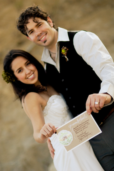
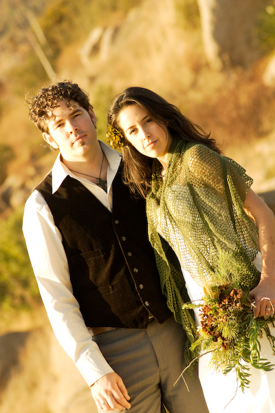
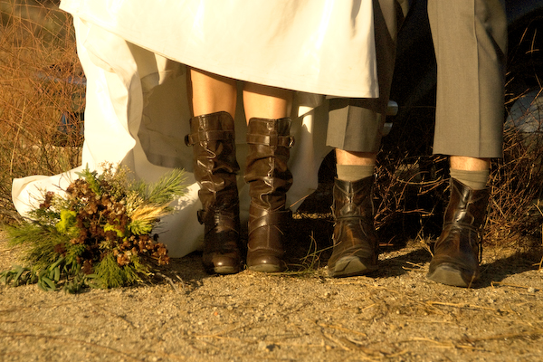
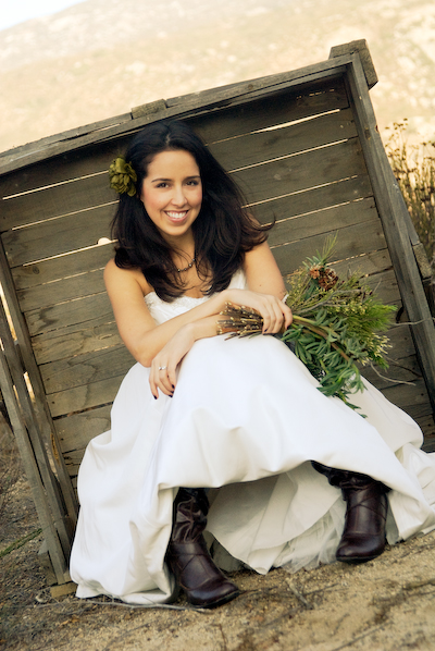
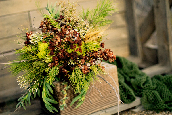
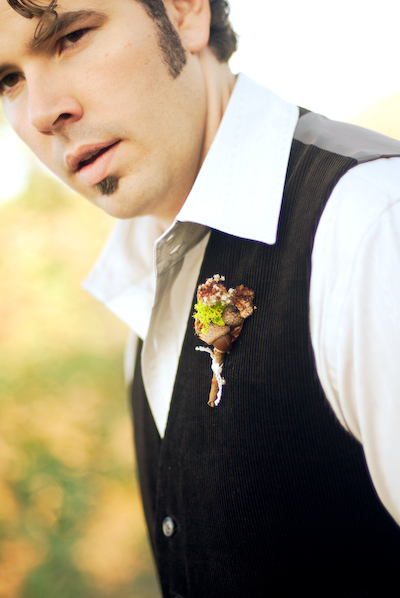
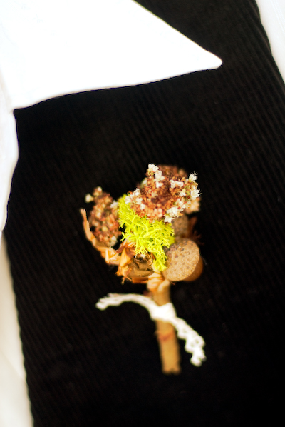
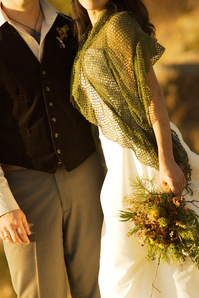
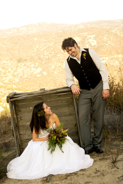
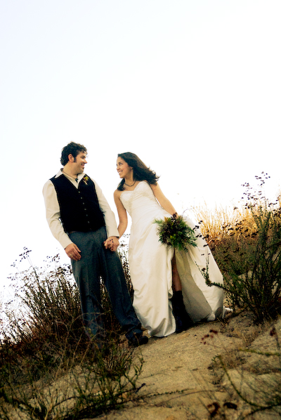
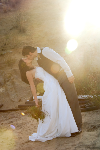
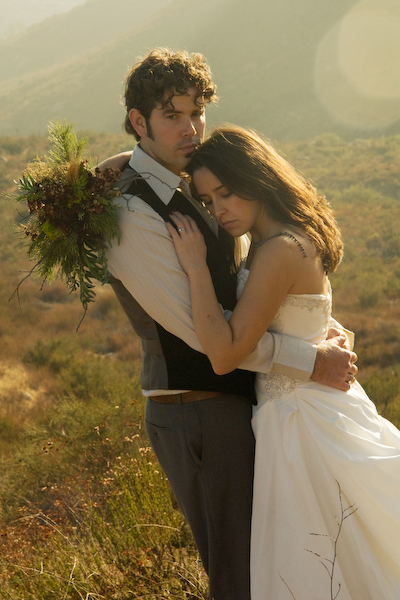
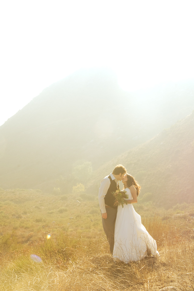
From Lauryl……’Esther and I had worked together on a wedding recently, but felt rushed during the reception set-up, so we decided to create a little ‘faux wedding’ photo shoot as an opportunity to work together again. Esther graciously offered up her gorgeous mountainous back-yard in Alpine, California, for the location, and we set to work designing a rustic, eco-chic affair.’ |
![]()
 |
![]()
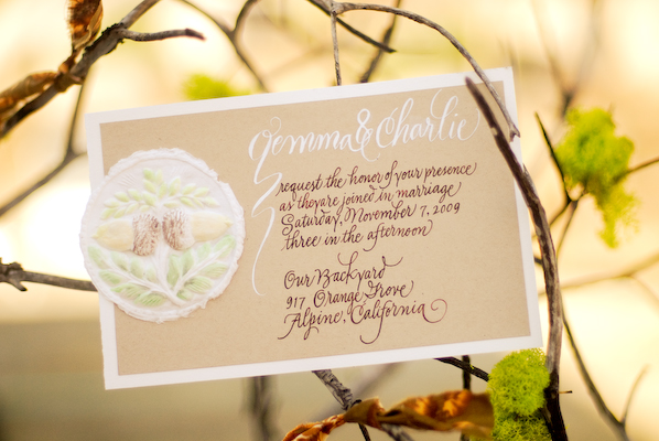
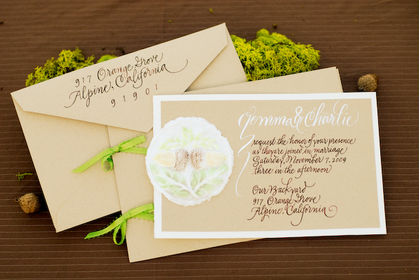
| Victoria shares a little info with us on the design of the beautiful invitations…….
‘ Lauryl told me they were planning a rustic-themed wedding, staged outdoors on Esther’s property. I looked at the inspiration board she created in order to get a general feel for the job and a sense of the colors to be used. Originally I thought to draw some manzanita branches on the invitation and placecards, but when she told me that they would be using acorns, my mind immediately went to my acorn molds. I was in ‘molded cookie production mode’ at the time, but I had also used the molds for paper castings and thought they would work perfectly for this project. The pure cotton linters that I press into the molds give such a fresh, earthy feel to the castings.After they dry completely, I hand paint them with special watercolors for that purpose (the pigments bleed less). They are tricky to paint because the water is rapidly reabsorbed into the fiber. While at my printer’s looking at paper samples, I happened on the recycled ‘Desert Sand’ brown stock. I knew immediately it was the look I wanted for this job… and that it would make a good background for the castings. I added the rich, textured watercolor paper as the background stock because I felt the additional contrast was needed, and I liked the way that it worked with the castings. It had a similar handmade quality (which it isn’t!) and that very natural fiber feel (which it is!). I combined the light and dark inks on the invitation suite but stuck with the white for the placecards. I was very pleased with the finished products, but the real thrill was seeing them in the tablescape setting where they appeared to capture so well the feeling of the wedding. I also love it when the invitation tells guests a great deal about the event to come!’ |
![]()
 |
![]()
| Guys, I am LOVING the invites and the calligraphy is STUNNING….simply beautiful!!! |
![]()
 |
![]()
 |
![]()
 |
![]()
 |
![]()
 |
![]()
 |
![]()
 |
![]()
 |
![]()
 |
![]()
 |
![]()
 |
![]()
 |
![]()
 |
![]()
| All the gorgeous details will be up in a few, so make sure you come back….they are AMAZING,…..thanks ladies for sharing all of your beautiful work with us today…check back in a litle bit…xoxoxo
Photography – Esther Summervile Ramsey |
![]()